Logo : Studio Lara
I had forgotten how much joy there is to be found in working closely with people to bring something to life. Studio Lara was just that kind of simple, joyous and creativity-affirming project.
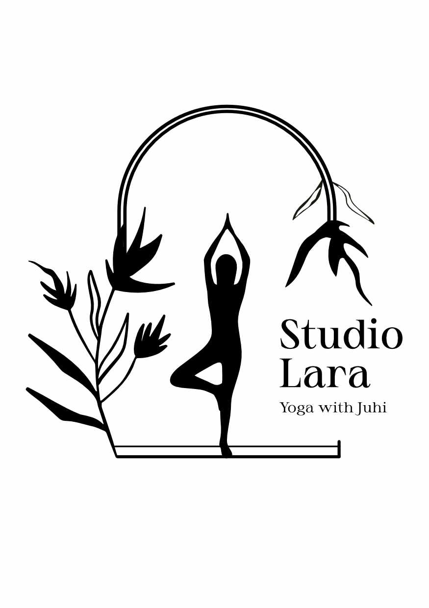
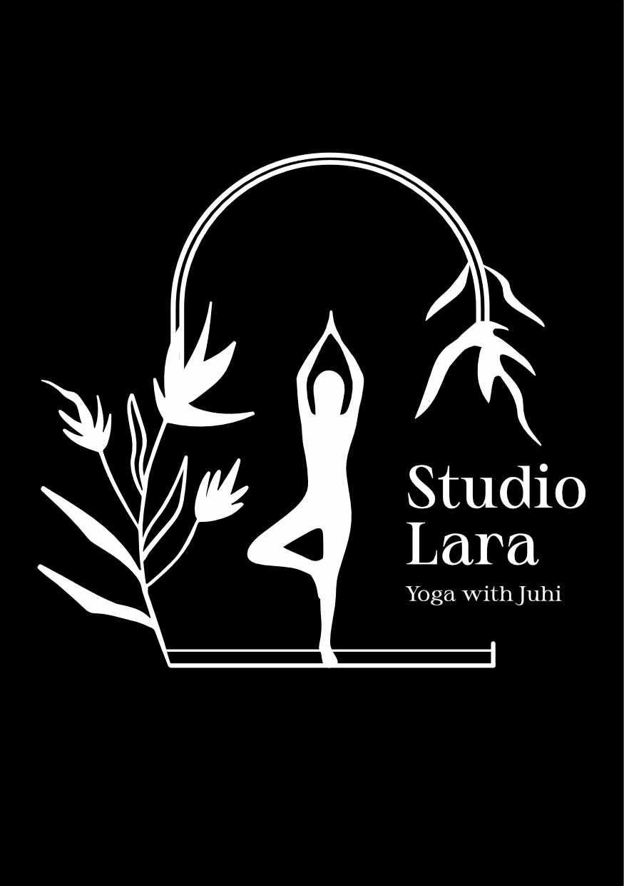
The Studio space is in an old Portuguese villa amidst a tropical garden and those were the elements that we drew upon and refined to create the logo. Vrksasana (tree pose) speaks to balance. A yogic tradition that the practice aims at finding through practice - in single colour (black).
Client Testimonial
I have always loved and admired Nomita’s artwork and knew that she would be the one to make the logo for my new yoga studio.
The process started with a long questionnaire (!) which seems daunting at first, but filling it in brought clarity to (as much as to Nomita) as to the look and feel of the logo the studio needed.
Over the next 4 weeks Nomita gave several options and iterations of the concept. Each iteration bringing us closer to our goal. The final outcome is a stunning and unique logo that perfectly captures the essence and energy of my yoga studio.
And I couldn’t be happier, or more grateful to Nomita 🙏
- Juhi, Studio Lara